Interior design and simple architectural decisions can be a great equaliser between compact healthcare clinics and larger facilities, if used correctly. In fact, with careful planning around the most appropriate colour lighting and decor options, you can maximise the sense of space in a fitout of even the smallest medical centre!
Here are four interior design strategies that can help bring out the best qualities in your small medical clinic.
1) Embrace minimalist design elements
The basis of all minimalist design is that ‘less is more’. The trend factors in colour, lighting, decor, graphics and architecture choices to create a relaxed aesthetic emphasising clean lines and clearly delineated spaces. Minimalism also embraces organised storage areas. All together, these elements provide a welcoming, functional space for patients and make administrative processes easier for your staff. Minimalist design also gives your reception and treatment areas an uncluttered, more wide-open feel.
The interior design trend uses relaxed lighting and neutral colours to encourage calmness. An Eco Architecture paper on how the pair effect architectural design found that light and colour quality semantically separate different spaces. Research also identified that while vibrant colours contribute to clear dimensions, muted colours increase our perception of indefinite space. This makes a room seem bigger and lighter. Further this design with equally neutral furnishings and reduce the amount of unneeded decor to create a more open floor plan.
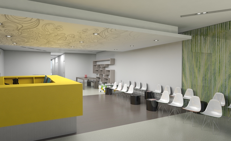
 Minimalist design embraces neutral colours and prioritises free-flowing spaces.
2) Focus on a patient-centred layout
Patients visiting a healthcare clinic usually seek their own space when waiting for an appointment, and appreciate privacy with friends or family. If you are pressed for space in a facility, this isn’t easy – but allowing visitors to rearrange the room’s furniture as needed ensures people aren’t crowded too close together.
Patient-centred healthcare clinics put control of layout in the hands of your visitors. Unfixed furnishings and decor allow individuals to create more intimate spaces should they want to, or open up the space for social interactions among bigger groups. This ability to rearrange the room is particularly useful for anxious patients – flexible furniture reduces the feeling of being trapped in a small space and opens up your reception and recovery areas.
 Patient-focused design allows visitors to take more control of their waiting experience.
3) Streamline check in and remove barriers
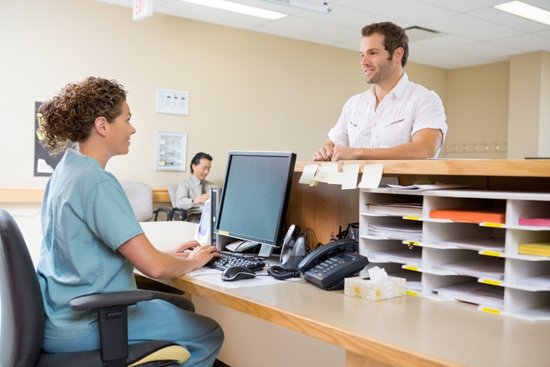
One of the major fixed points in any healthcare clinic – and most significant uses of floor space – is the reception desk. While it’s essential to have a focal point for administration and visitor enquiries for staff and visitors, this doesn’t have to be restricted to one large area with a desk. Business journal Inc claims that a fixed reception station can be unwelcoming or imposing, putting a physical barrier between your staff and patients. One solution is to remove this inflexible check in point and free up floor space by designing a mobile reception.
A design team can create flexible and open reception and administration area through a few key elements:
- Digital check in and customer service kiosks.
- Roaming patient support staff.
- A separate administration room.
In this solution, patient-facing roles fulfilled by the traditional receptionist area are replaced with touchscreen kiosks and support staff. This streamlines patient check in and makes your small clinic interior design sleeker. Meanwhile, a separate administration room offers a space compromise between an effective working environment and maximised floor space for patients.
 Digitised check in means you can redesign your reception area to maximise your floor space and get staff closer to patients.
4) Bring an outdoor aesthetic inside
Biophilic interior design is a strategy that brings the beauty and spatial dimensions of the outside world into internal spaces. This design element is often used in communal spaces – such as reception areas, onsite cafes or recovery rooms – to promote a calming atmosphere. The principal tenet of a biophilic design strategy is to replace artificial light where possible with sunlight. Eco Architecture research demonstrates that natural light has a more positive impact of space perception as it doesn’t create harsh shadows like indoor lighting does.
This change in lighting is achieved by blurring the lines between indoor and outdoor spaces. Design trends like glass curtain walls, outside communal atriums and integrating public greenery into the building entrances are popular in the biophilic movement. These styles also expand the perceived size of your medical clinic beyond its physical boundaries and change patients’ sense of scale.
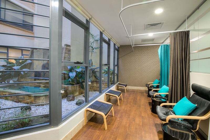
 Blending outdoor and indoor spaces offers a greater sense of open space – ideal for small clinics.
The Space for Health design team have helped with medical clinic fitouts of all sizes. From medical facility construction projects down to clinic redesigns, we specialise in creating intriguing spaces that maximises your space, and appeals to patients and staff.
For more information on how we can make the most out of your small clinic interior design, contact Space for Health today. We have a unique vision to suit your exact requirements!


